Visualizer
The exploration room of every workspace. Six relational maps across keywords, questions, competitors, visibility mentions, tech audit failures, and the existing blog mesh.
Executive summary
Three short paragraphs explaining the feature and value.
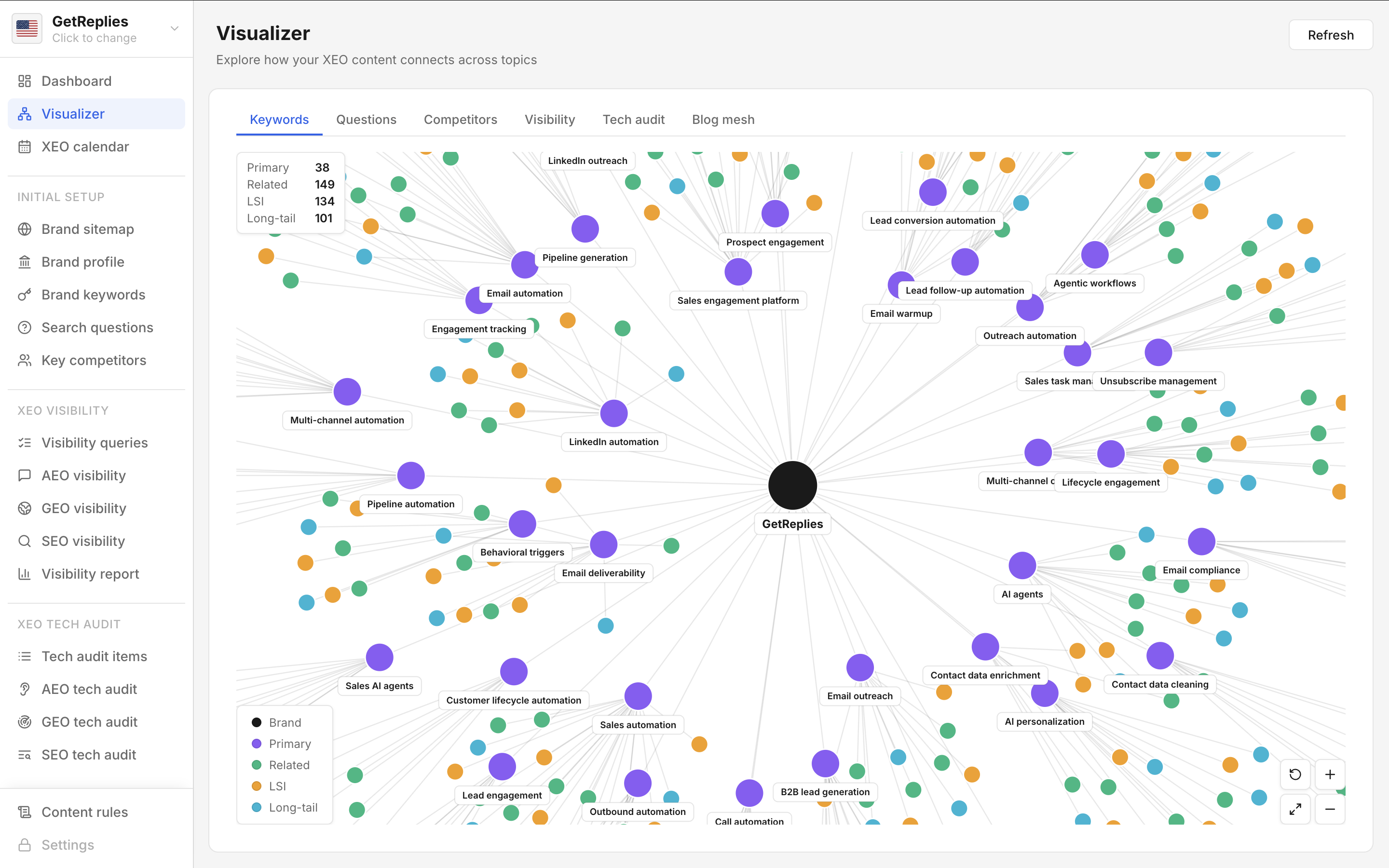
The Visualizer is the exploration room of every GetXEO workspace. The Dashboard tells the user the score; the Visualizer shows the structure behind the score. Six tabs draw relational maps you simply cannot see inside a table: keywords, questions, competitors, visibility, tech audit, and the existing blog mesh.
The Keywords and Questions tabs show clustering: tightly related terms sit close together, outliers float at the edges. The Competitors tab is a network: closer brands compete on more queries. The Visibility tab draws edges from queries to brand mentions across AI models. The Tech audit tab heat maps failures across pages.
The Blog mesh tab is the most actionable: it shows how your existing blogs interlink, surfacing tight clusters with cross cluster bridges (healthy) or isolated blogs that link nowhere (unhealthy). AI engines reward well interlinked content, so the Blog mesh view becomes a remediation action list straight from the visualisation.
Key highlights
Five capability points teams should know about quickly.
- Six tabs across keywords, questions, competitors, visibility
- Keyword and question clustering surfaces coverage gaps
- Competitor network reveals real category overlap
- Tech audit heatmap clusters failures by page
- Blog mesh view becomes a remediation action list
Top FAQs
Five common questions answered for fast practical clarity.
What does the Visualizer show?
Six tabs draw relational maps: keyword clusters showing topic coverage, search question clusters showing intent themes, a competitor network showing query overlap, a visibility map showing mentions across AI models, a tech audit heatmap clustering failures by page bucket, and a blog mesh view of existing internal interlinking.
When do marketers actually use it?
When a marketer has a hunch they need to confirm visually. The Dashboard answers what; the Visualizer answers why and where. Typical session: someone notices a score moved and opens the Visualizer to spot the underlying pattern, like two competitors clustered around the same query set explaining the drop.
How do I know the visualised patterns are signal versus noise?
Visualisations are computed from the latest scan data directly, not synthesised. Cluster boundaries reflect actual semantic similarity in the scanned keywords and questions. Competitor edges reflect actual shared queries from the visibility scan. Patterns that hold across two consecutive scans are usually signal worth acting on; patterns that flip between scans are noise to discount. Hover any node for the underlying numbers.
How does the Visualizer feed into content prioritisation?
The blog mesh view doubles as a remediation backlog. Isolated blogs that link nowhere become Content refresh candidates. Tight clusters with missing edges suggest internal link opportunities. Competitor networks surface category gaps the brand has not addressed yet. Most marketers leave the Visualizer with a sprint level action list identified visually before opening the Content refresh table to execute.
Does the Visualizer export?
Not yet directly. The Visualizer is currently a read only exploration surface inside the app. For exports, the dashboard and visibility report PDFs include summary leaderboards covering the same competitive data the Visualizer renders graphically. Visualizer specific exports are on the roadmap for future releases as a refinement.